NYPL Blogs
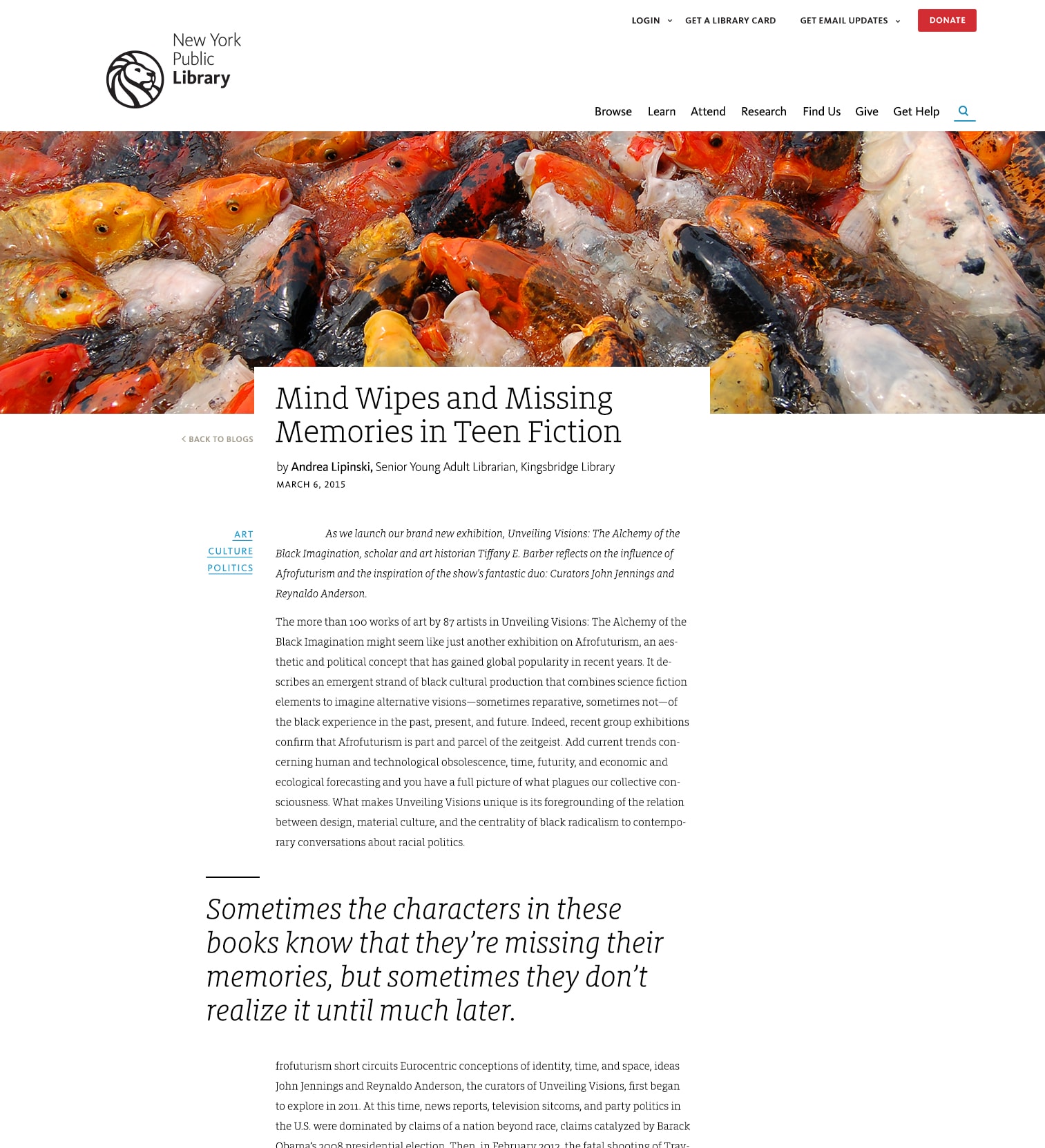
A component of the NYPL redesign efforts centered around a significant overhaul of the Blogs section. Our task; to evaluate critical areas of the blog to improve. From improving fundamental readability to restructuring the layout, we approached the task with two critical constituencies in mind, those being our readers and our bloggers.
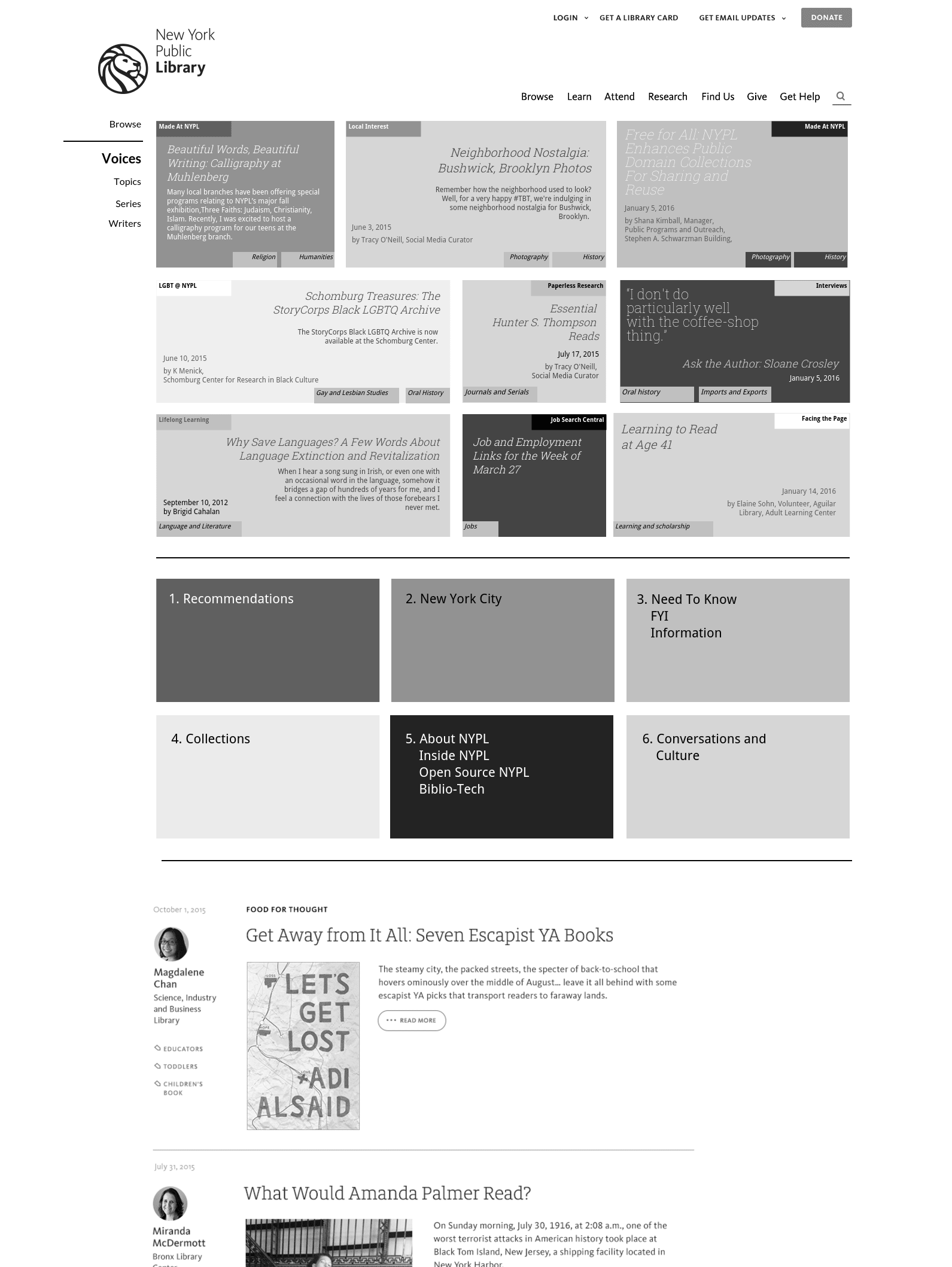
Our initial concepts centered around presenting a grid or masonry layout of blog artifacts representational of the breadth and depth of the NYPL blog ecosystem.
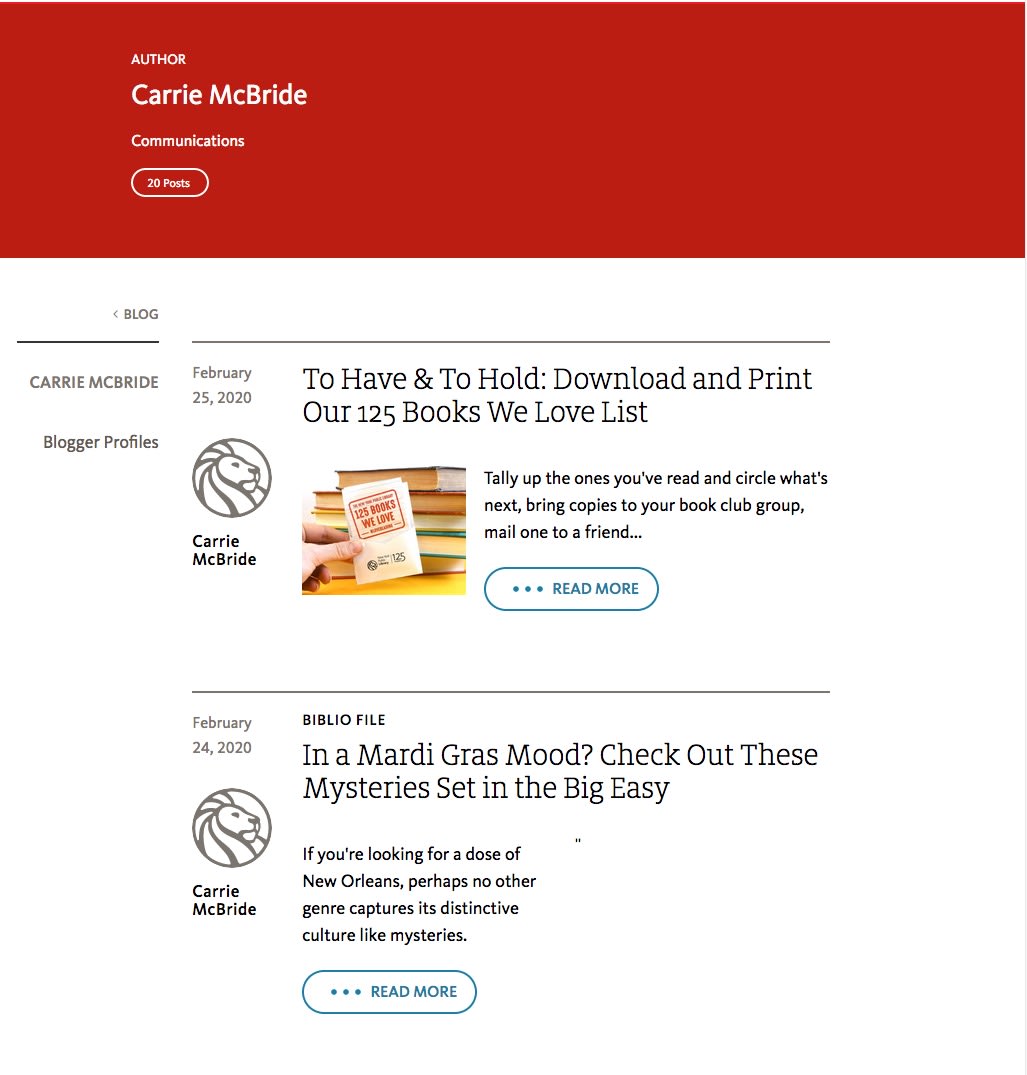
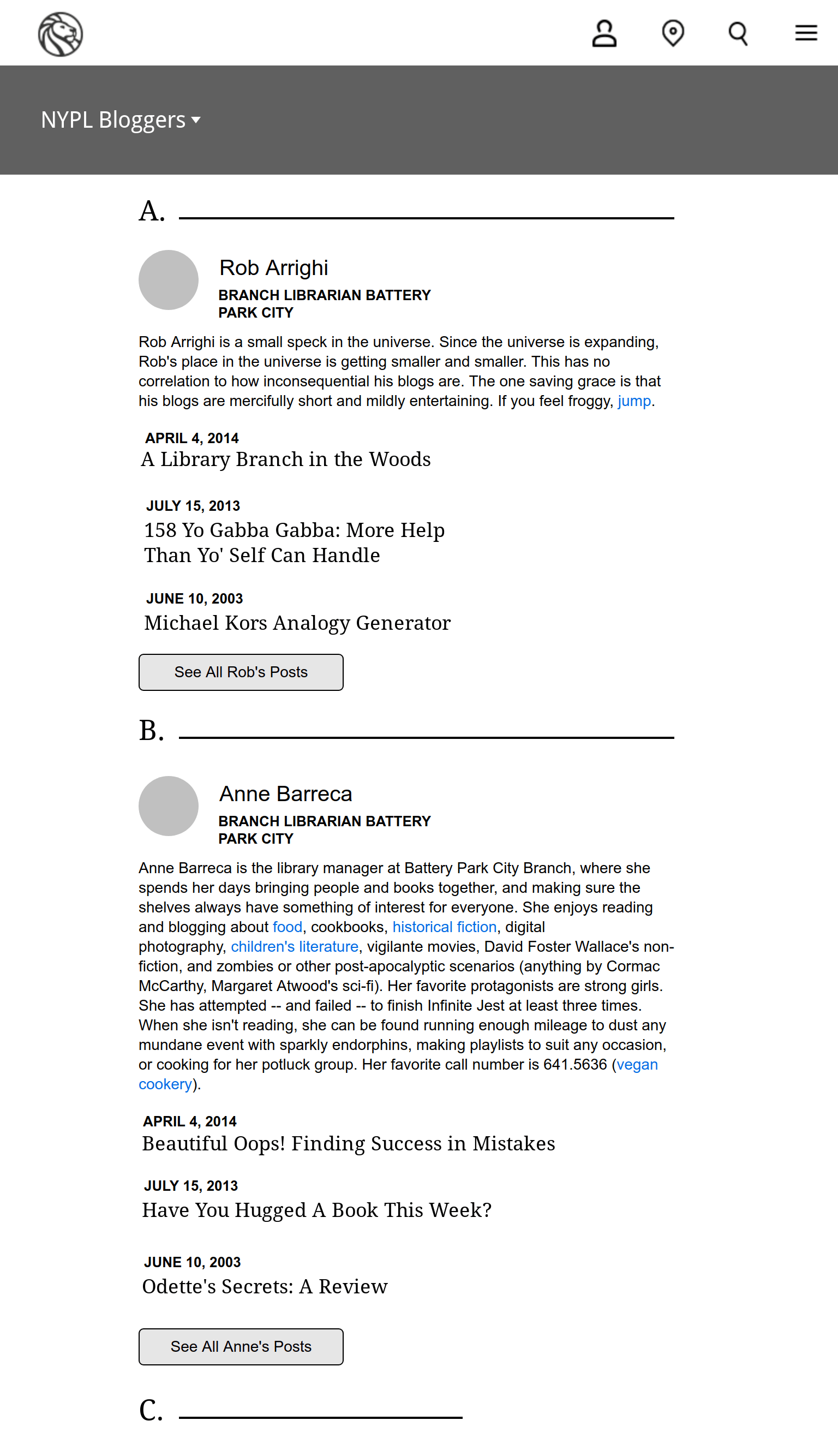
A key feature requested from the librarians was to have an author's index. This simple prototype screen was the result. Ultimately this feature was never implemented, but I think it was a great solution to a persistent problem facing staff: How can staff quickly scan a given author's post and locate an article and share it with a patron?
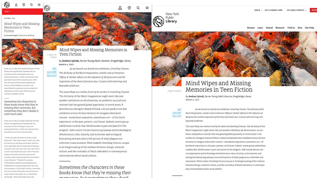
Our design employed many new fields from the post editor that were not present in older iterations. Rather than try to make the old post work in our new system, we opted to make the old post's fields the default for our new layout and let editors add in their new content (images, block, and pull quotes) going forward.
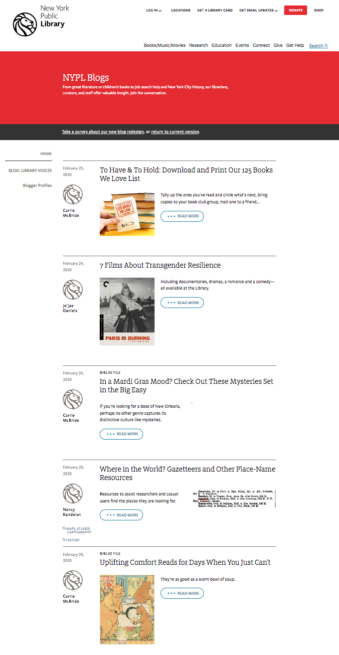
We encountered several issues centered around how to present older posts in our new layout. Ultimately we decided to move forward with putting as much of the blog post's content to work in a variety of page contexts. If there were images anywhere in the post, we ingested it, and used that image for the header, even where aspect ratios and resolutions might be less than optimal.
