NYPL Design Toolkit

The Design Toolkit at NYPL was our online style guide and foundation for a more extensive design system. We wanted to free the front-end developers up from having to make design decisions and create an opportunity to develop reusable components and styles. We also needed to have robust documentation and code examples.
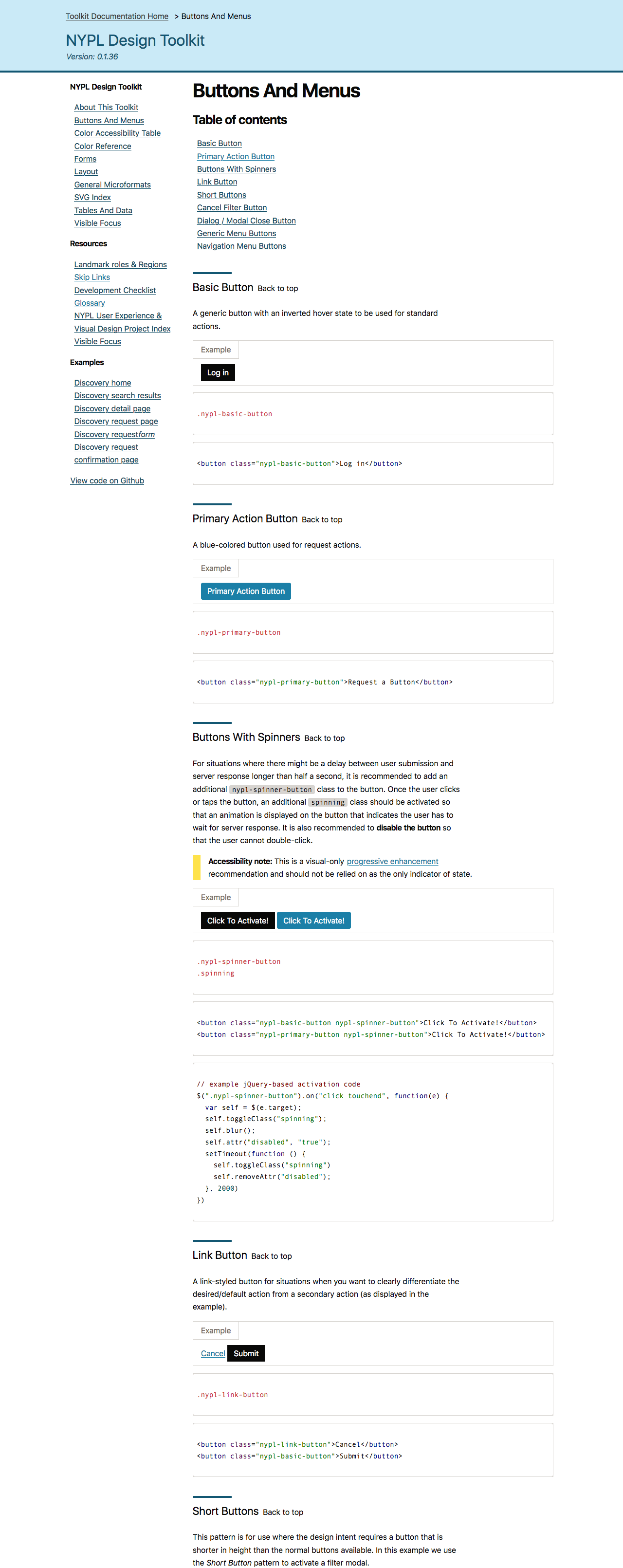
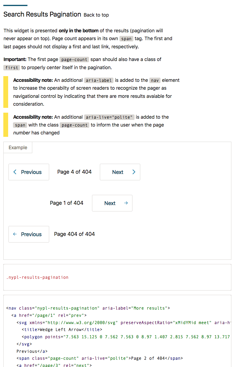
SVG Icons
We wanted to follow industry best practices and reduce our use of raster images to improve page performance and overall bandwidth usage. Part of that effort was to employ SVGs wherever we had flat, simple graphics, like icons and logos. SVGs are markup and, while not cacheable, are very flexible and portable. We took extra precautions to ensure our SVG icons were accessible.

Accessibility
We conducted an extensive survey of nypl.org and all of our internal tools, micro-sites, and applications for proper WCAG 2.0 Compliance. With the understanding that the Design Toolkit will need to inform and influence all projects going forward. For structure and style to be fully accessible by default, all components included in the Design Tool Kit would have their accessibility rules baked into their design patterns.


We paid close attention to getting our forms correct. Assigning the exact ARIA attributes and states was key to our implementation.

Components
Broadly speaking, the guiding principle in our design was to remove as much guesswork a developer might have concerning design, structure, or behavior. The final product culminated in two avenues for implementation. The first method is via an NPM module install. Which could then be integrated into a given application. Another way to use the Design Toolkit is by compiling the Sass file. Then copy and paste the individual instance of a component into one's app.