Native Bound Unbound

This exciting project required me to step outside my typical role as a designer and developer and take a holistic, managerial view of the project. My role encompassed, among other things, writing technical documentation as a technical liaison between the director and development studios as well as developing strategies for content, working with graphic designers, and interviewing potential development firms.
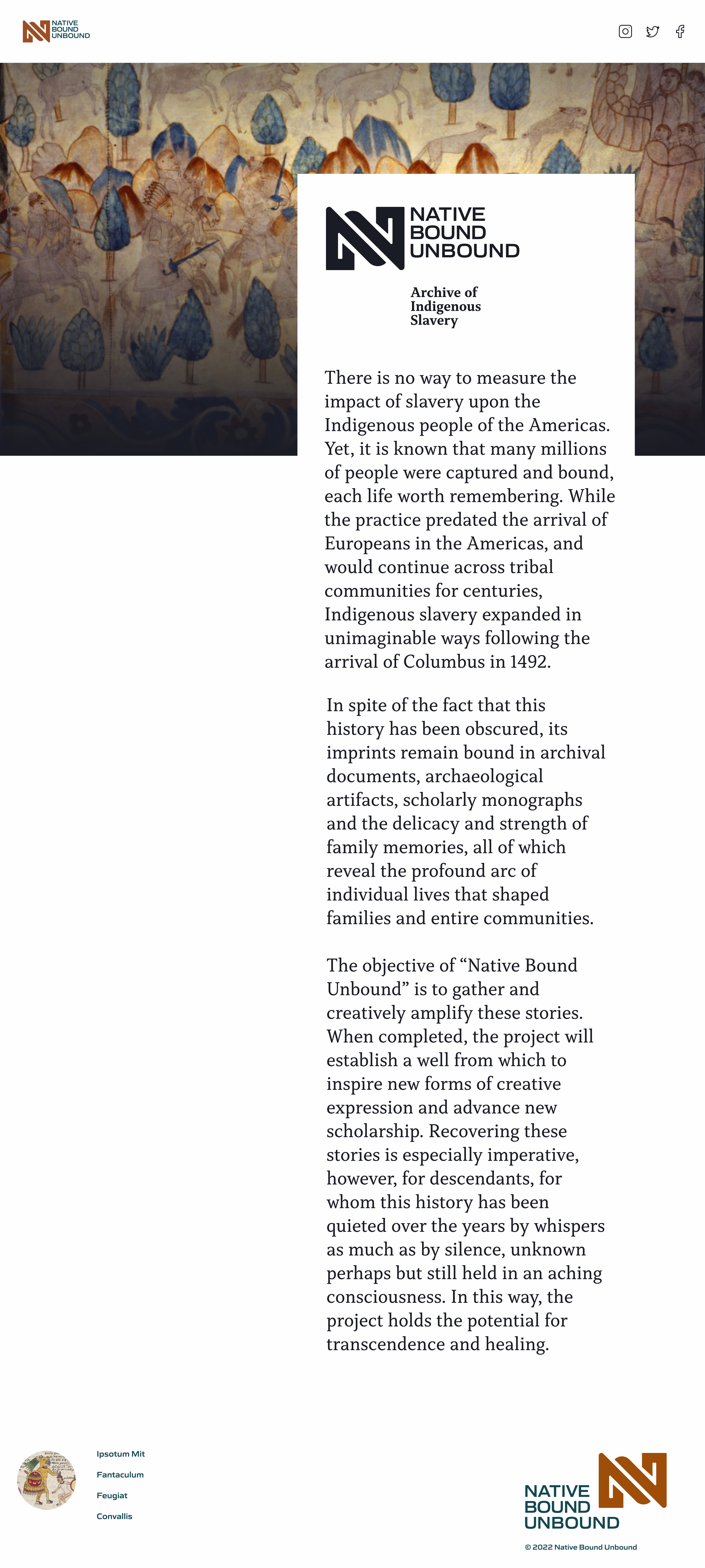
Project Overview and Objective
Although obscured from the national narrative and consciousness, Indigenous American slavery was a definitive experience for many millions across North and South America, including in entire regions of the United States. Records that reveal these experiences currently exist in archival repositories around the globe, including legal cases, censuses, letters, last wills, newspapers, photographs, and church records, such as baptisms, marriages, and burials. Museums steward tapestries, pottery, and more that also reflect Indigenous slavery. Individuals and families also hold personal records, objects, photographs, and remarkable stories about their ancestors. Collectively, all these archival imprints and cultural expressions encompass the indelible stories of people, places, and moments in time and, when drawn together, reflect a unique story of both the brutality suffered and the resilience of those that passed through it.
The project will serve as a major source for educators, scholars, storytellers, artists, and, most critically, descendants, both individuals as well as the broader collective.
At the outset, I defined the technical possibilities and restraints. I developed strategies with Dr. Galvez to bring the vision to life. We discussed the breadth and scope of the project, how it fits into today's cultural climate and technical limitations. We reviewed similar projects and met with other scholars and developers.
I specialize in design and development. As the project advanced, I was excited to work on the technical aspects of the project. We needed to create a proof of concept to understand the project's scope fully. To do this, I had to expand my knowledge of back-end processing, database setup, and building the front end, which could interact with the database. Additionally, I was responsible for user experience, visual design, and creative direction. While I claim to be an expert in only some of these areas, my professional experience working with cultural institutions allowed me to ask the right questions and explore the best technological solutions for the project.
For the purposes of this portfolio page, I will focus on my design work. The following examples are representative of the work I have done concerning visual design and design system development.
Visual Design and Art Direction
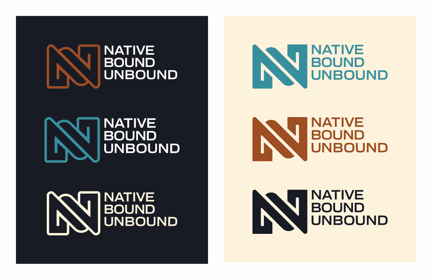
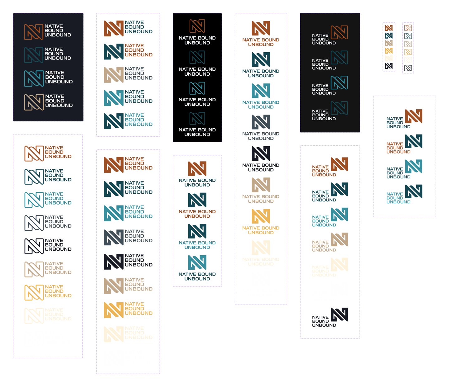
My initial investigations began by working with the logo designer's color recommendations. I built out the color set and expanded the possible use cases for the logos. The color themes inherent to the logos were helpful, but I needed to create a more versatile and sturdy design system. To do this, I had to broaden the range of colors and typography to accommodate different scenarios. We needed to account for body copy, several different headline levels, and various potential typographic contexts.
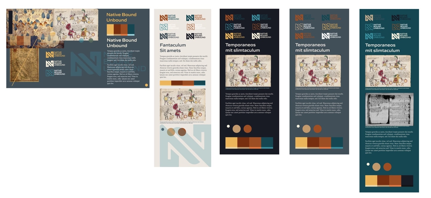
Theme Exploration
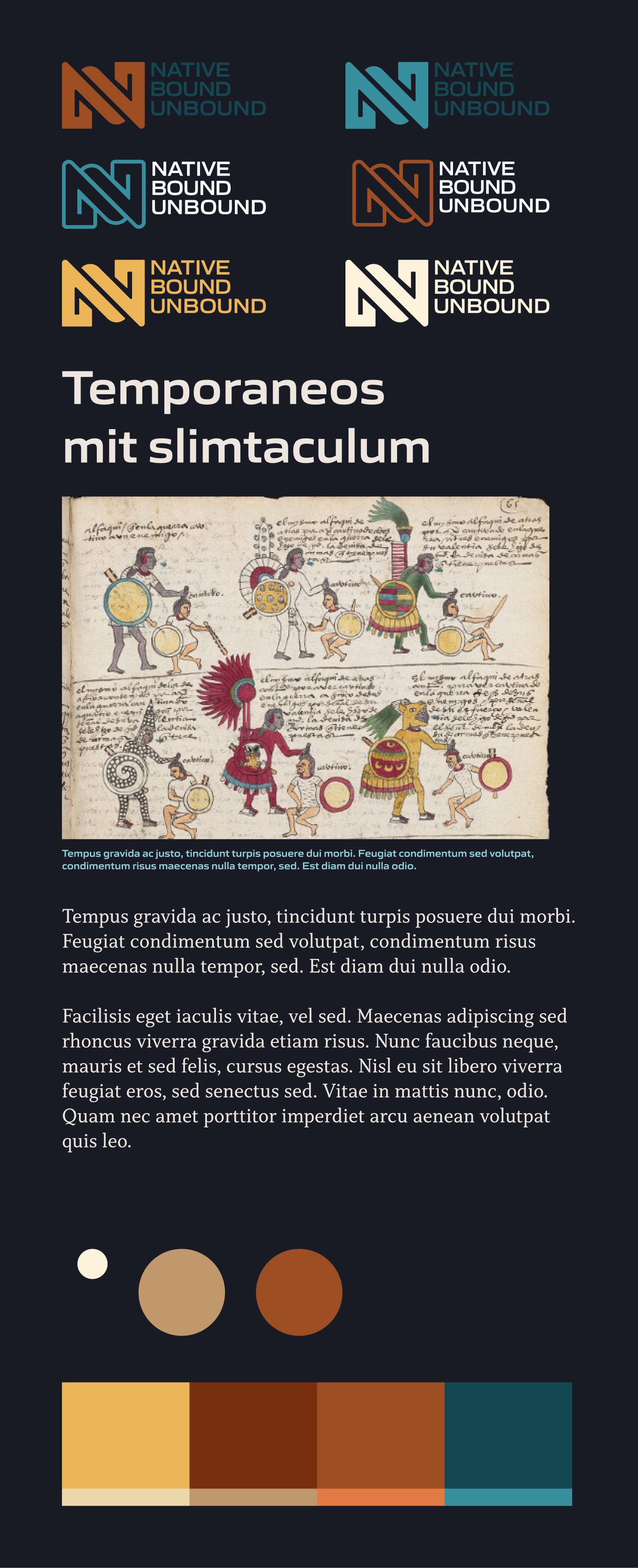
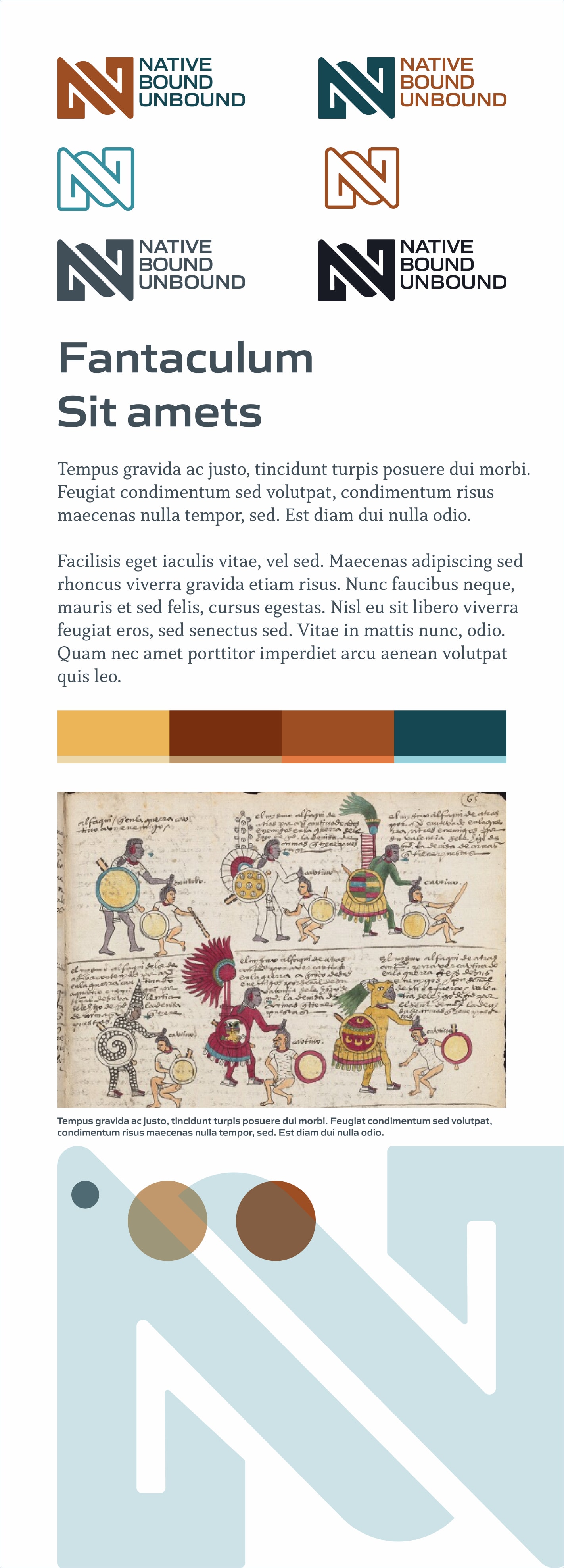
Color and Branding Design

Typography
I began the design process by determining the typefaces and scale needed to achieve a visually pleasing composition. I utilized an online tool called utopia.xyz. That tool allows you to choose a scalar, upper and lower bounds (largest & smallest) and it will produce a set of scale rules allowing the designer to create a scalable type and layout system. This system takes advantage of the browser's capabilities to render a page back to the viewer at the right size for their screen without the need for breakpoints.

The fundamental aspect of the typographic work centers around headline and body copy type styles. All other forms are derived from these two core design artifacts. The reasoning behind this methodology is to sustain a very low level of design complexity. In my Figma, Sass and HTML I can easily modify these core elements and rely on cascading to effect all the descendant styles and layouts.

Atoms and Molecules
Button Sets
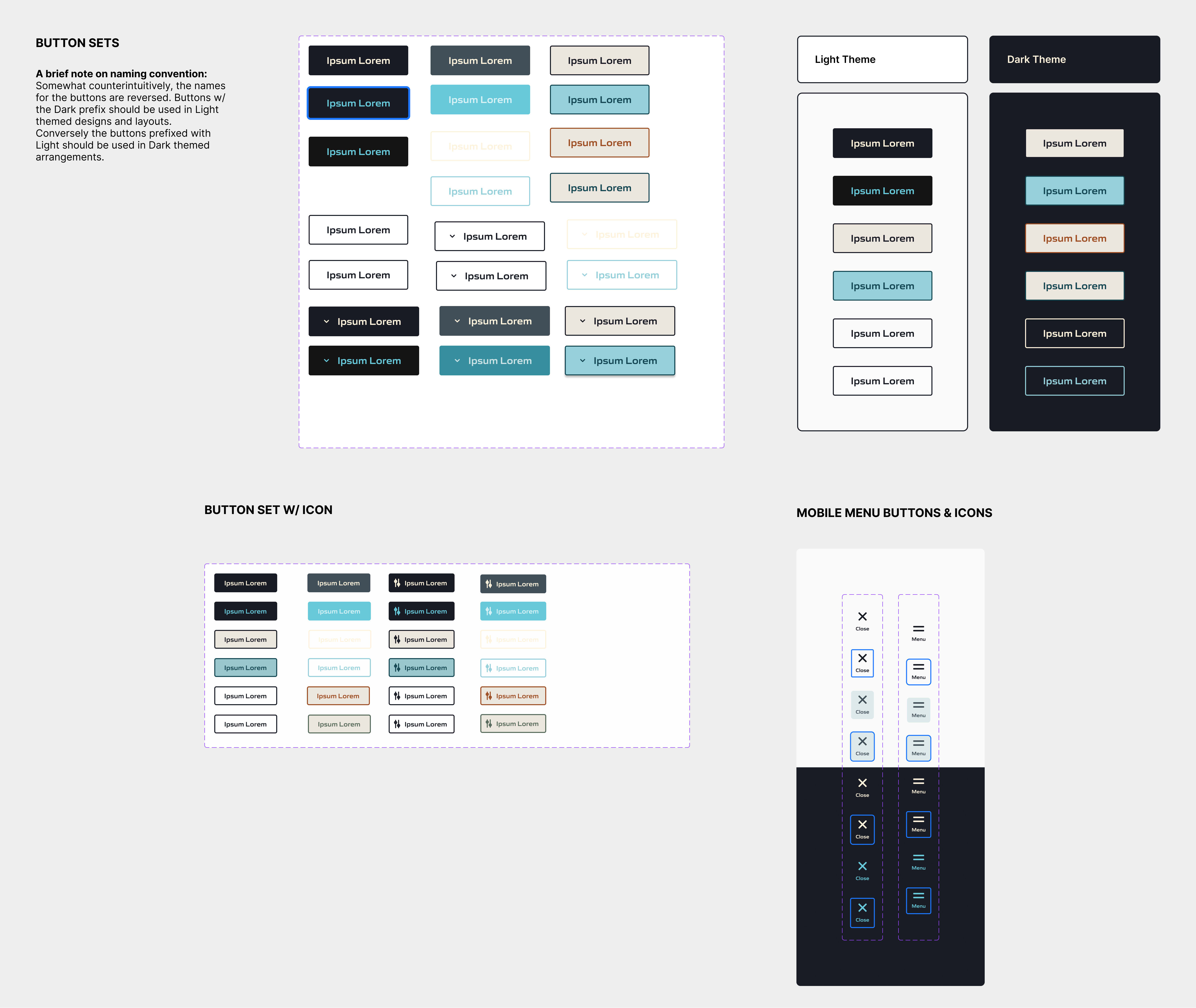
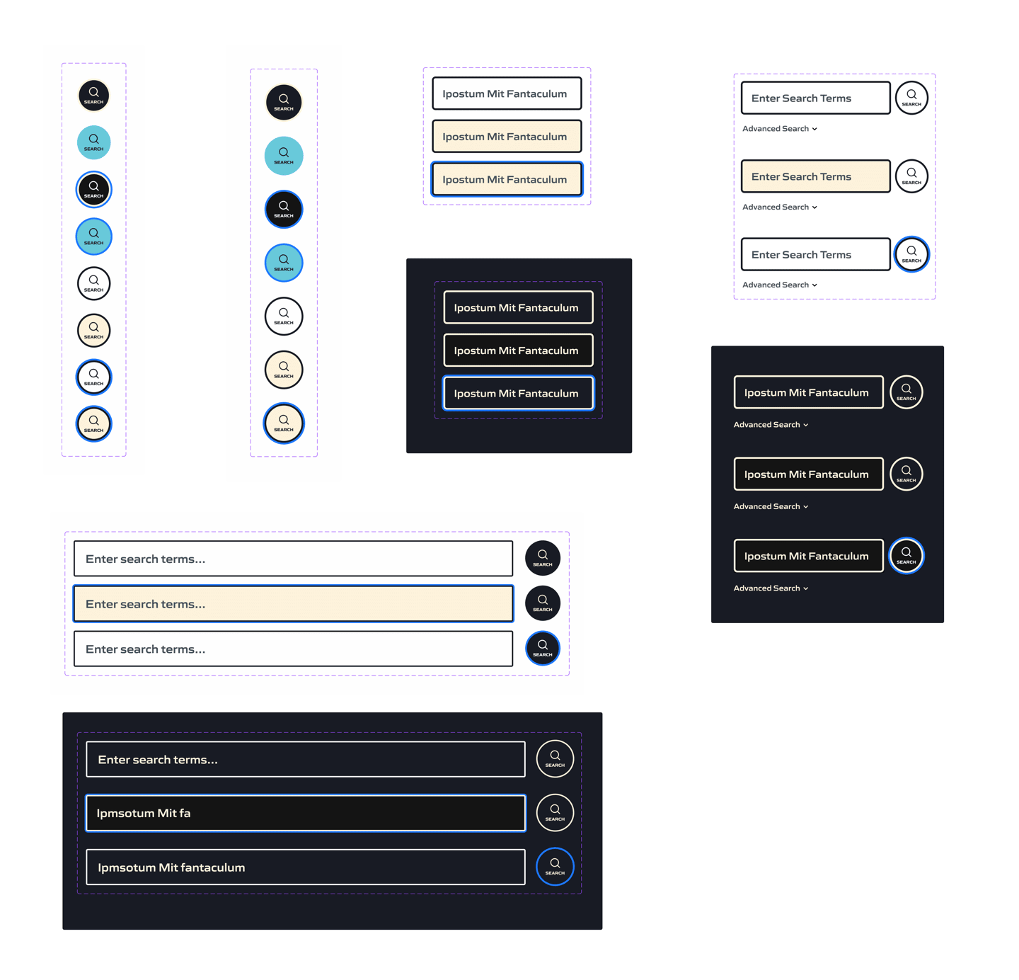
The proximal phase of the design process was to identify and apply color and type treatments to foundational screen elements, often referred to as "atoms." These elements are primarily composed of input fields and buttons.
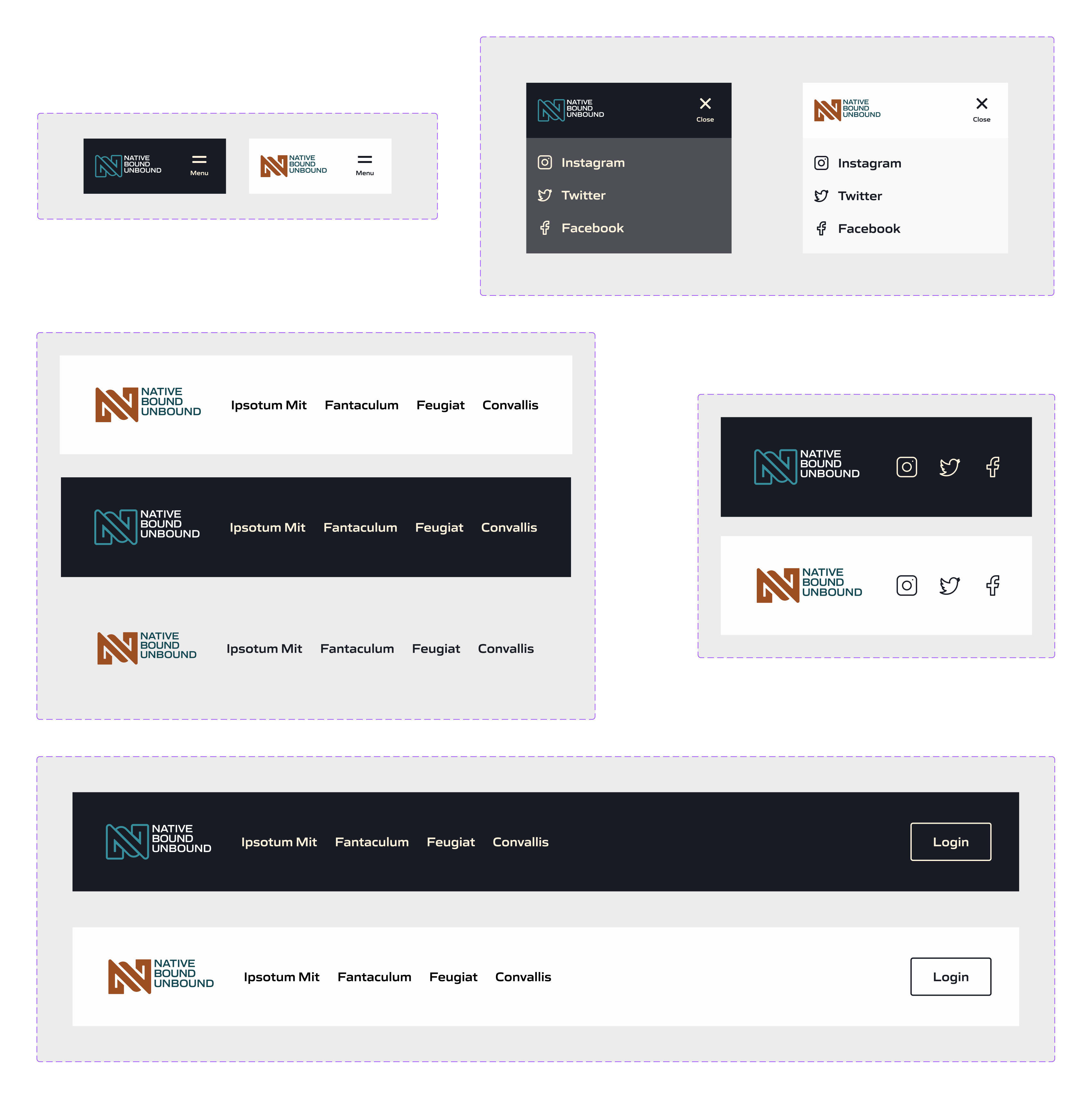
Components
Following the essential and more fundamental elements are components derived by compositing together the core elements. These tend towards more complex arrangements; again, the essential nature of these elements is their relationship to their origins within the ecosystem. Of primary importance is navigation. For both small and large screens, I devised a simple and flexible solution where designers or engineers could easily add any number of navigation items.
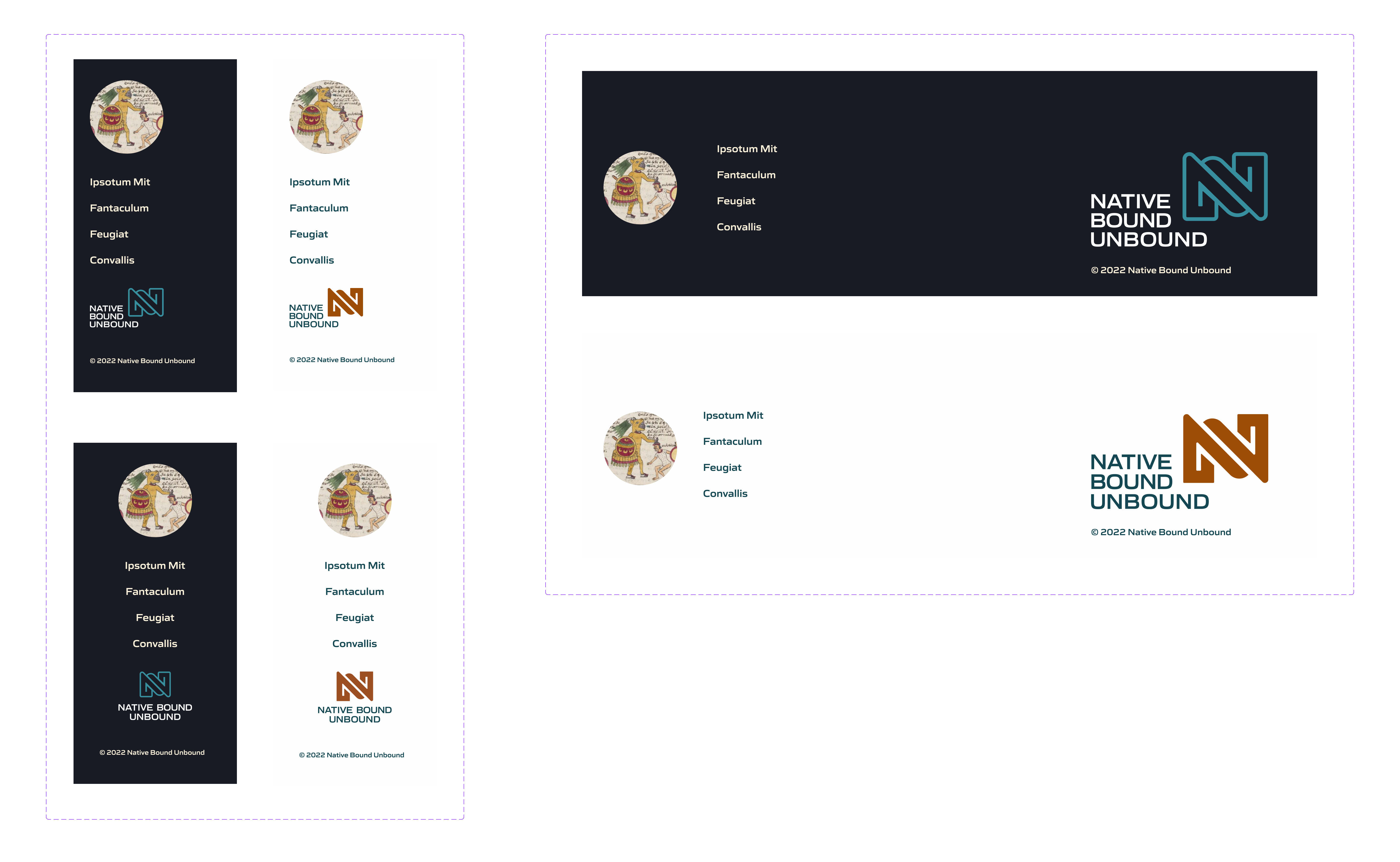
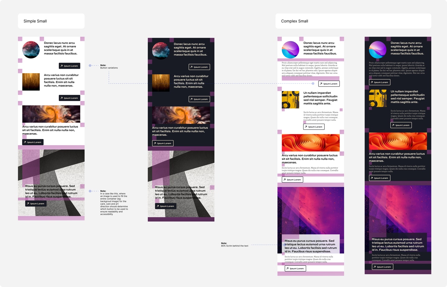
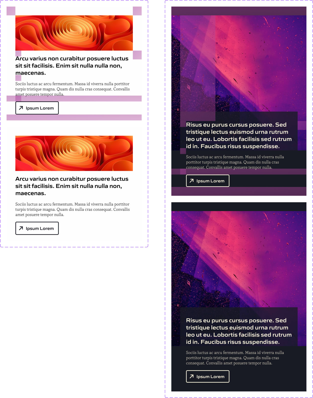
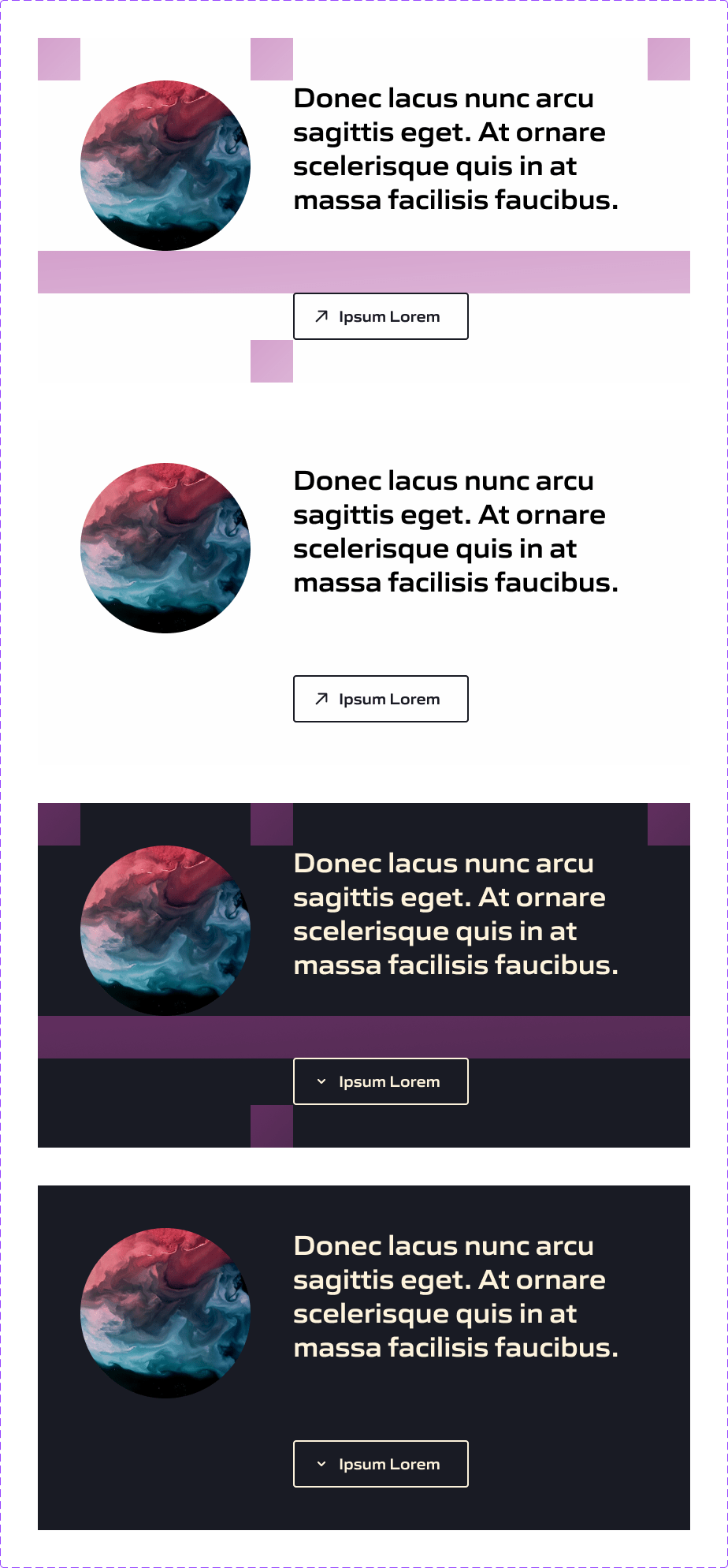
As much of the content work has yet to be defined the team requested that we have a variety of cards in place to handle the potential for different types of content and levels of complexity.

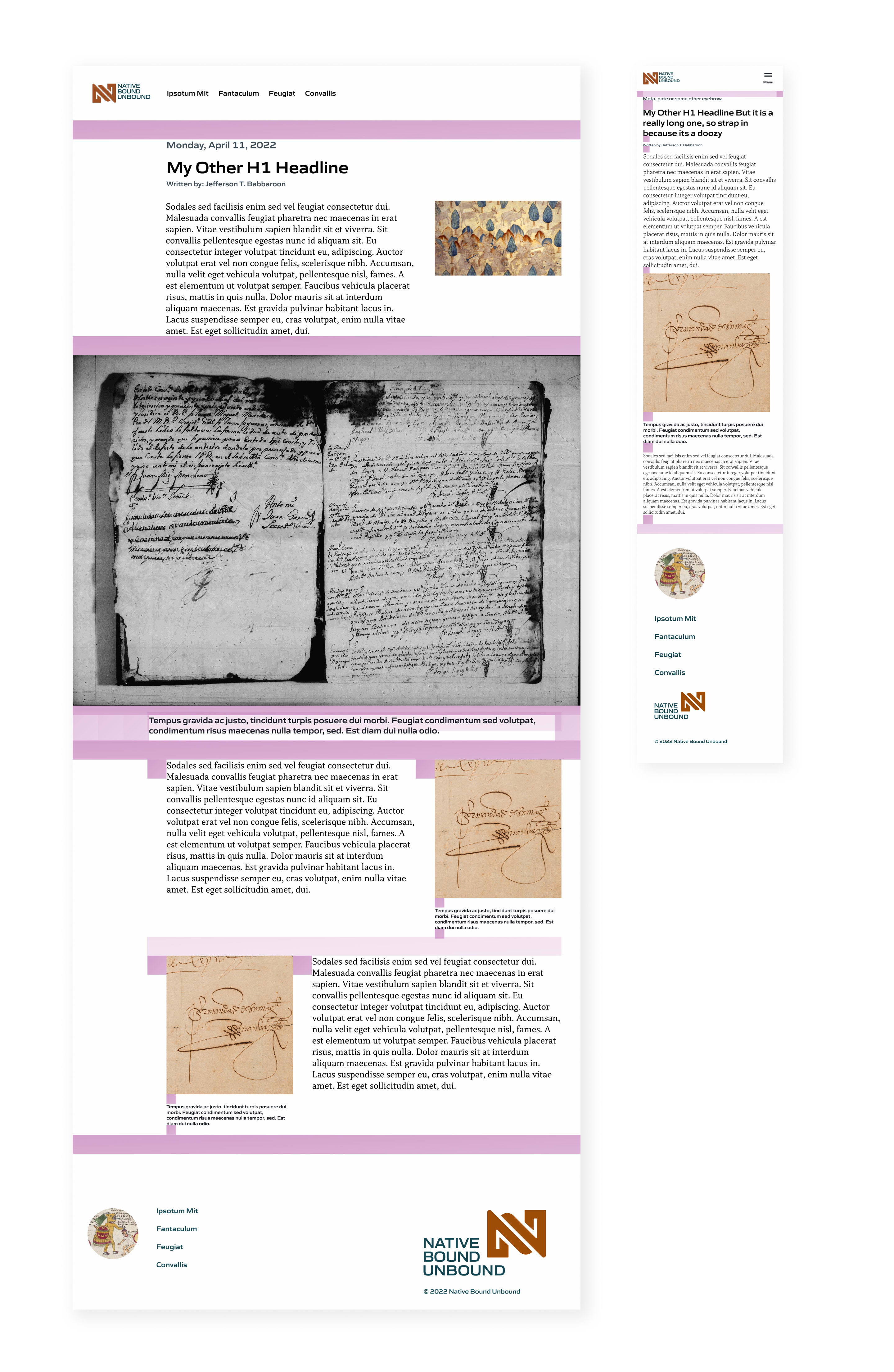
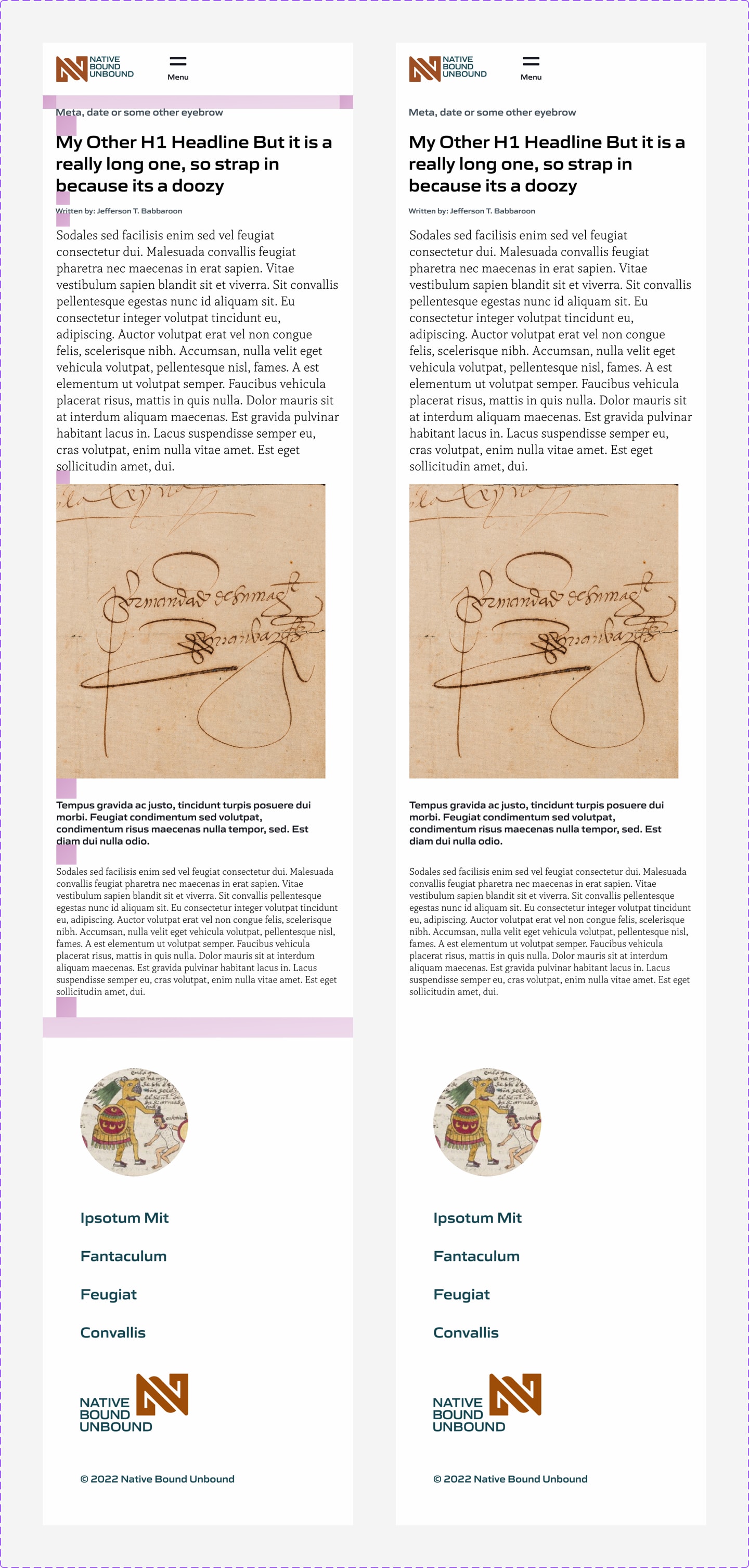
Page & Screen Layouts
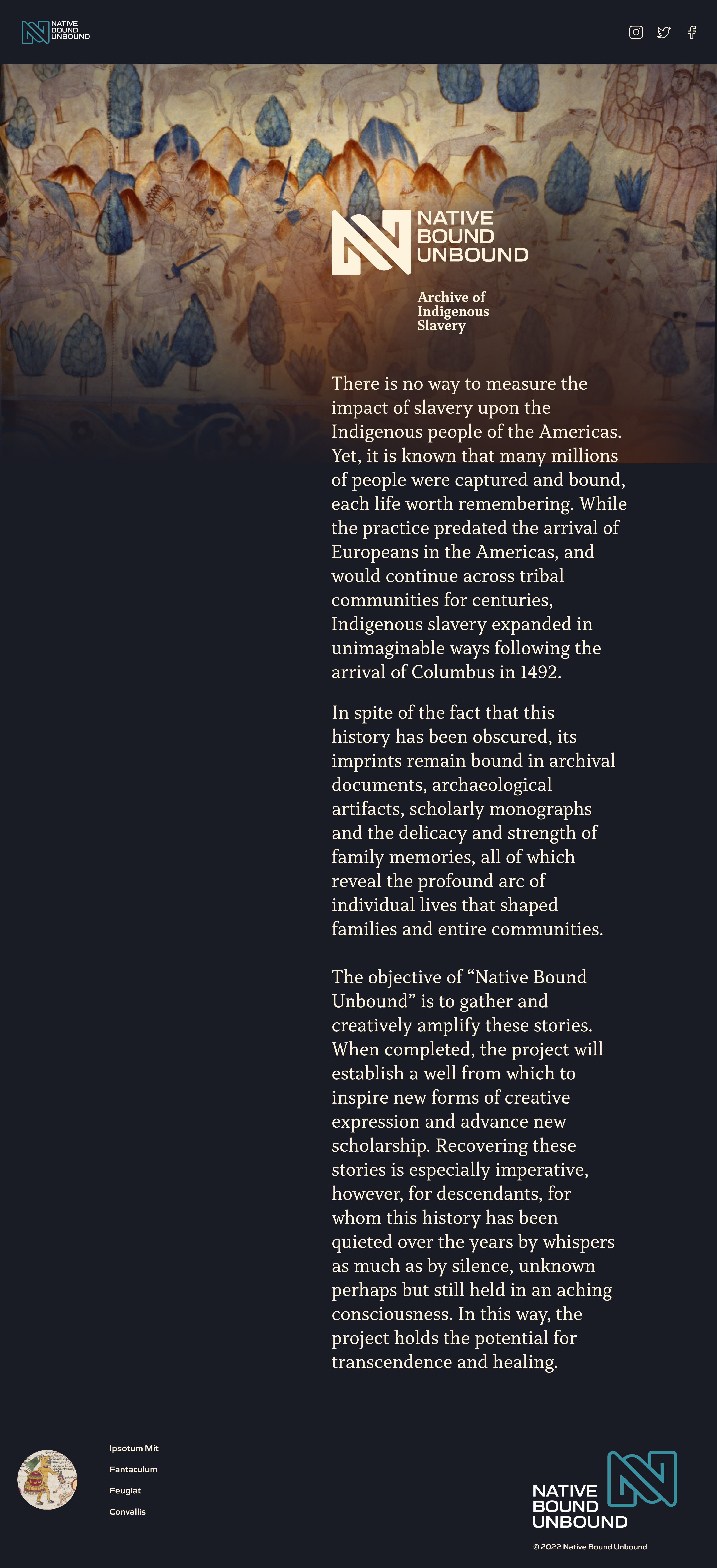
At the time of this writing, the design system has been approved and is ready for deployment. The home page utilizes all defined aspects of the system; color, type and layout. The Figma files are complete and can be easily used by the both front-end and design staff.
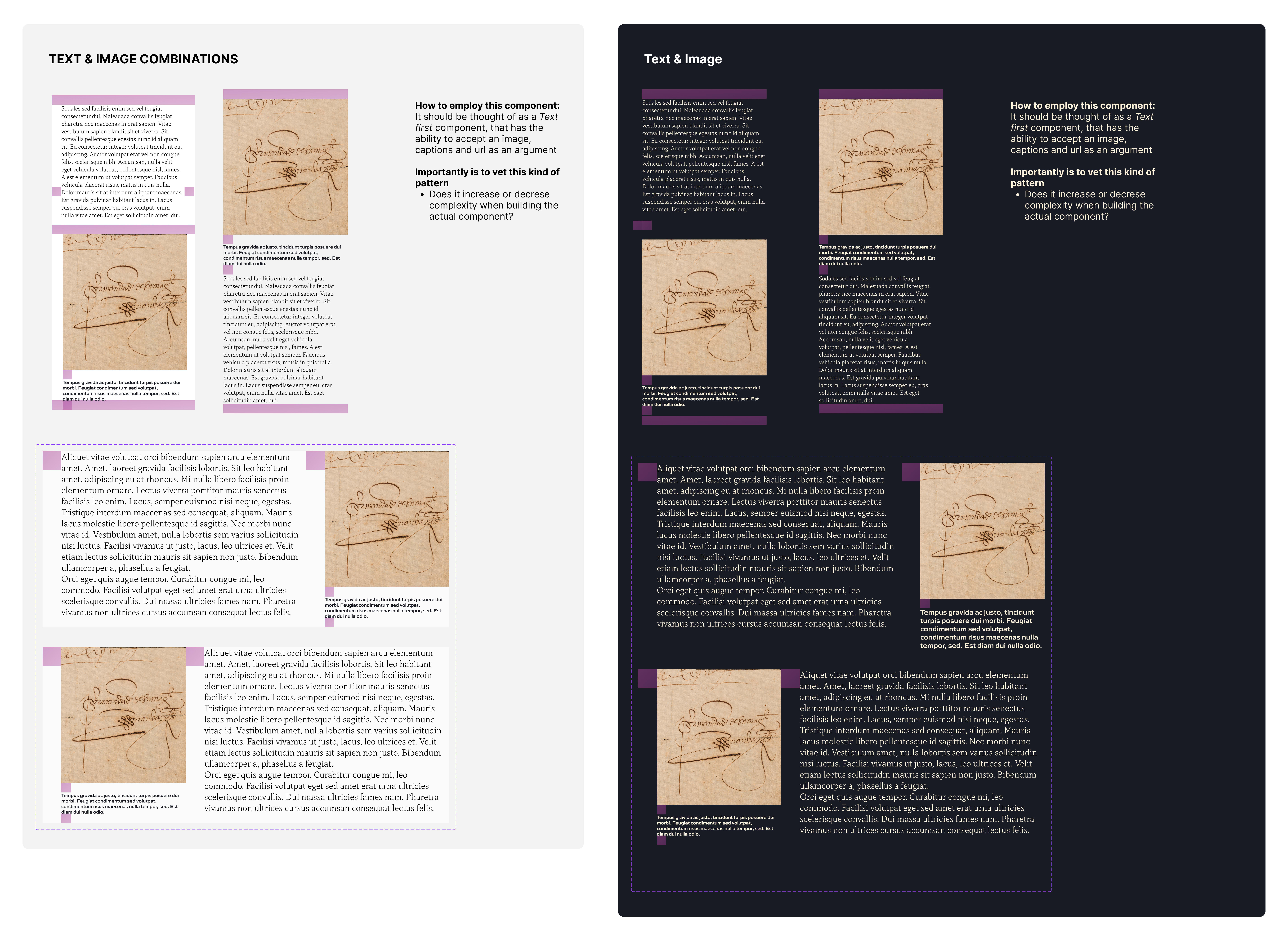
Composed interior page layouts
The following is a Figma layout demonstrating a full page composite where components are assembled to define a layout for both mobile and desktop. I like to move away from these terms and refer to screens as large or small. My thinking here is that we should move away from specifics about user devices and think more broadly. I also like to include helper elements (the pink blocks and bars) on their layers for ease of toggling. This serves as an assistant to myself and other designers. Providing a very quick read on spatial correctness as defined by the defined scalar rules.