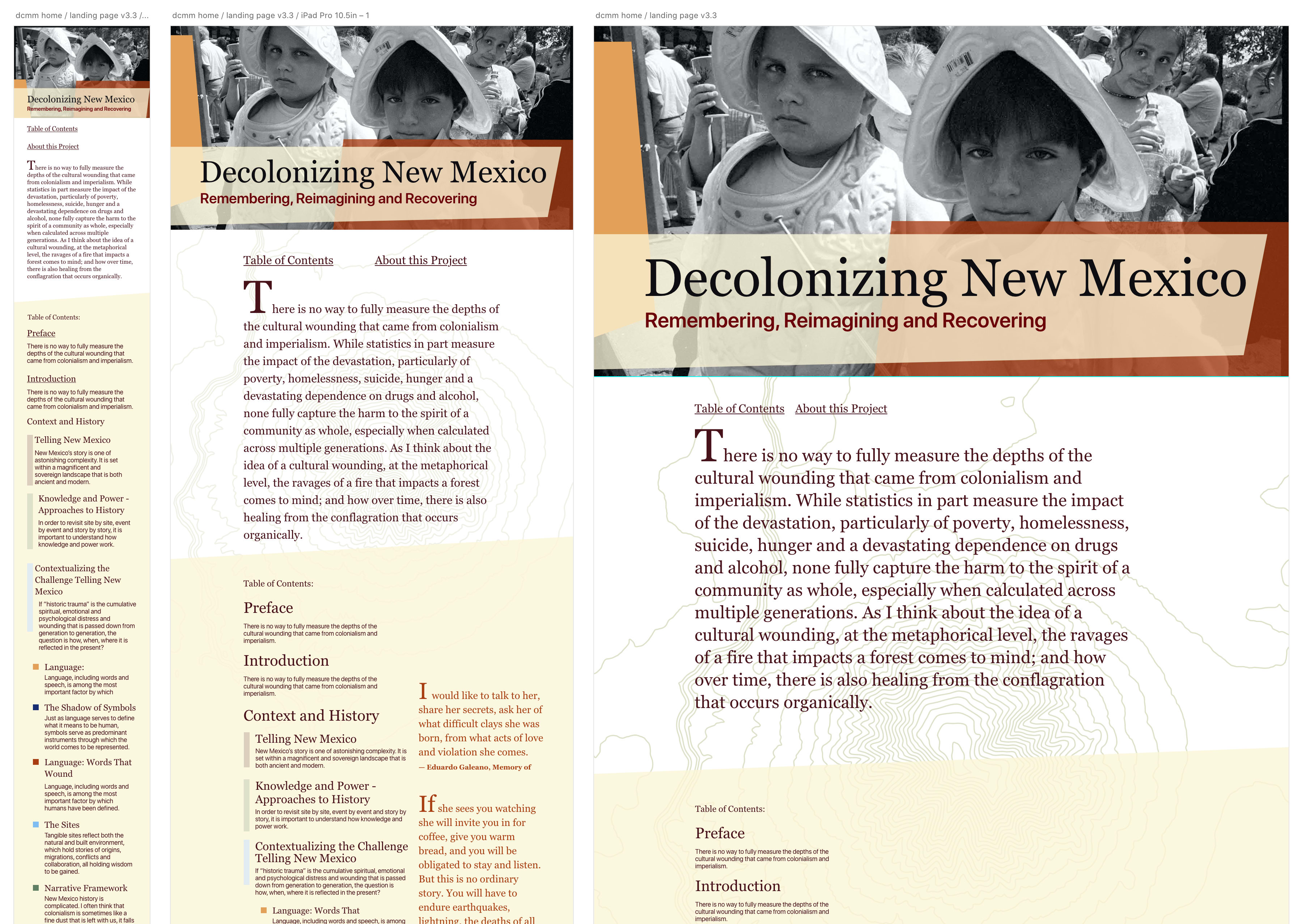
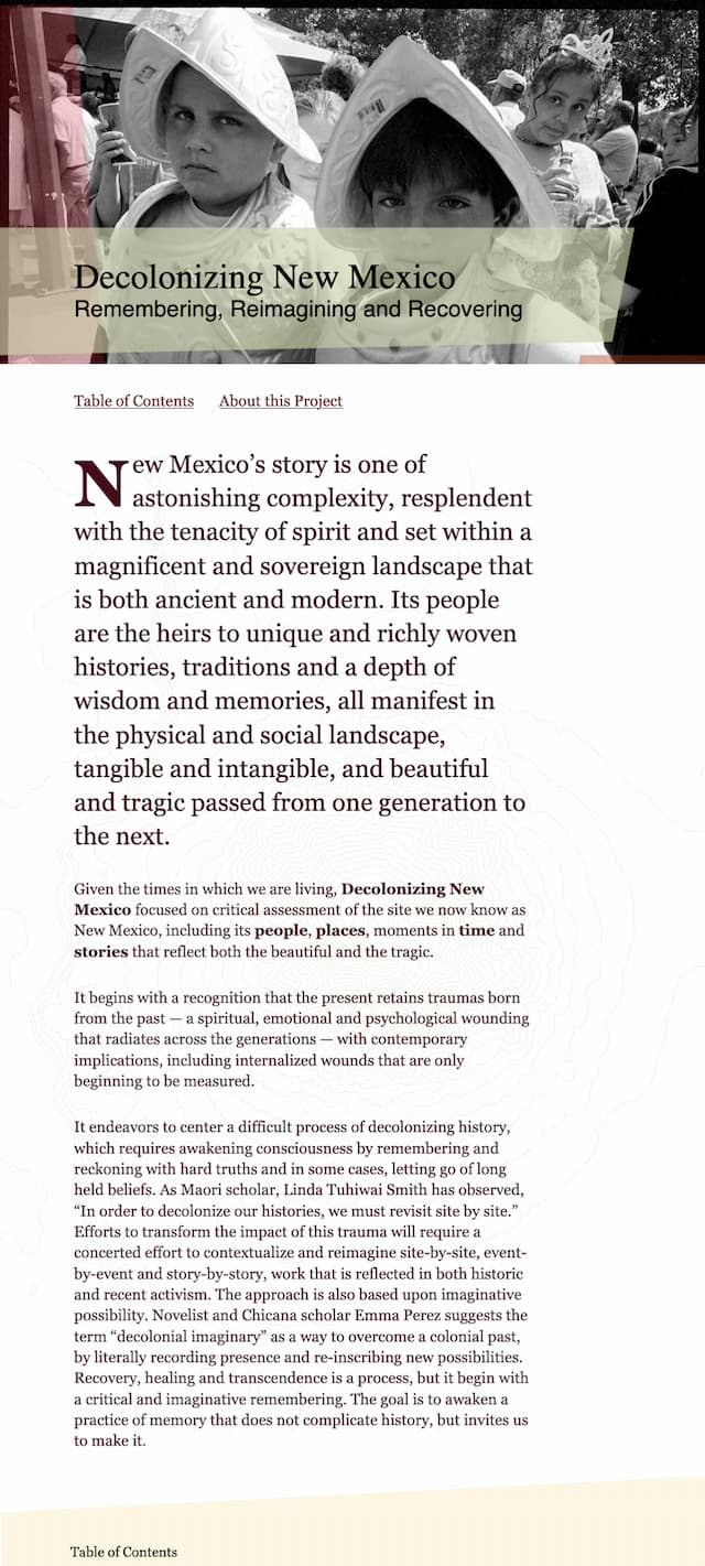
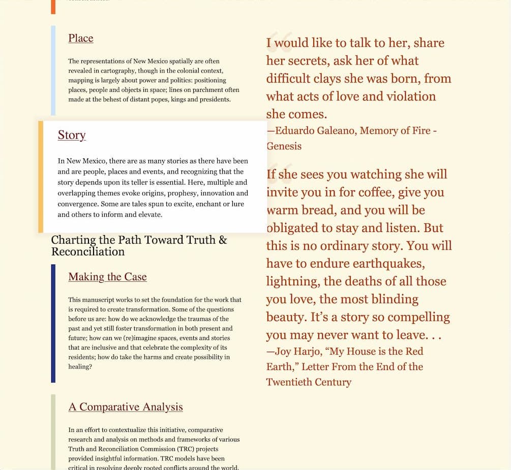
Decolonizing New Mexico
Decolonizing New Mexico is meant to gather historical context and ideas toward the development of a process, centering truth and transformation in New Mexico. The project is designed with flexibility for growth and expansion as new material is created and added. I designed the entire project to be as lean as possible. The design and prototype work was executed in Adobe XD, the site was built with Hugo. For hosting, we use Netlify hosting / deployment and Forestry as the CMS for easy and very intuitive content management.
The project grew out of an informal consulting relationship when Dr. Rael–Gálvez contacted me for advice on how he should go about creating and publishing his paper "Decolonizing New Mexico" to his website. Rather than bury this timely and important piece in PDF form there, I suggested we create a website. As a result, this project we collaborated to create this project. It gave me valuable insight and experience working with Hugo, Netlify, Forestry and modern CSS, HTML and JavaScript, as well as ancillary technologies like git, and bash scripting.
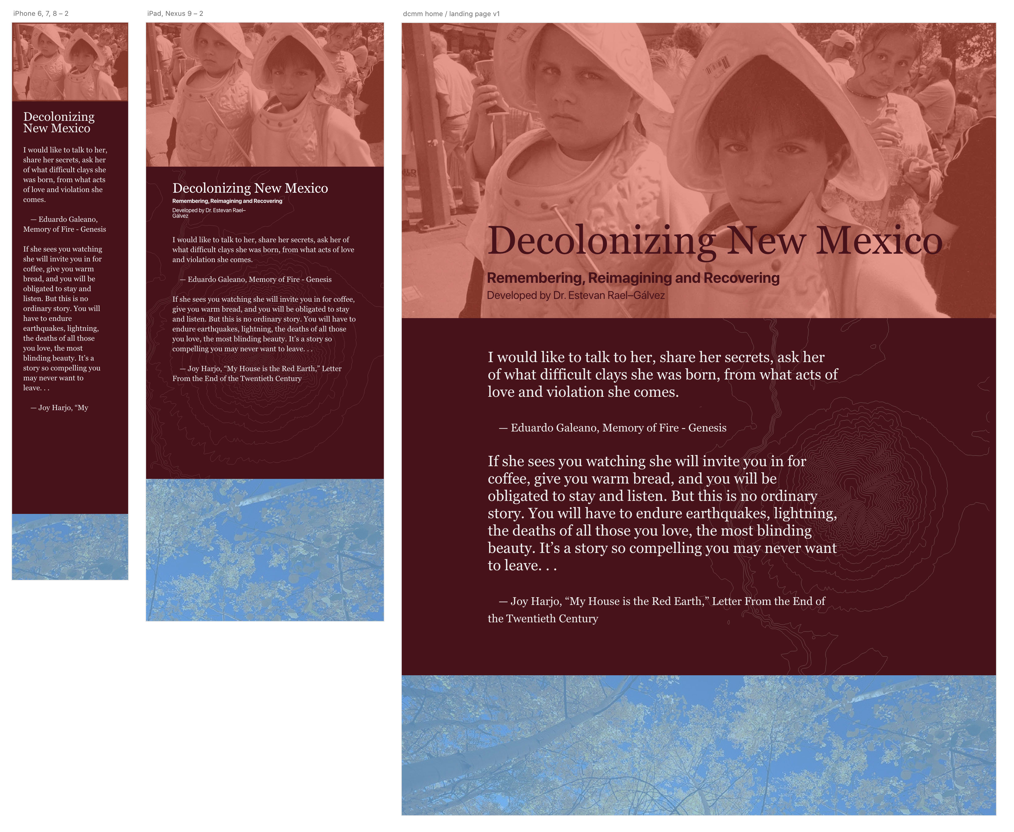
This project was also a first for me as all the layout and design work was executed with Adobe XD. While initially I felt hampered by the unfamiliar interface, overall I think it's a fine product and will use it again.
For simplicity sake and to avoid needless shift in layout, I opted to use system typefaces. I often rely on a stack composed of the major sets of system fonts found across the most popular devices. By doing this we provide a very reliable and familiar experience. Users will see their own system's fonts in use and they will not experience FOUC (Flash of Unstyled Content.) Additionally, by not adding another request, often to a different source for typefaces, the content loads faster and we save our user's time and bandwidth.
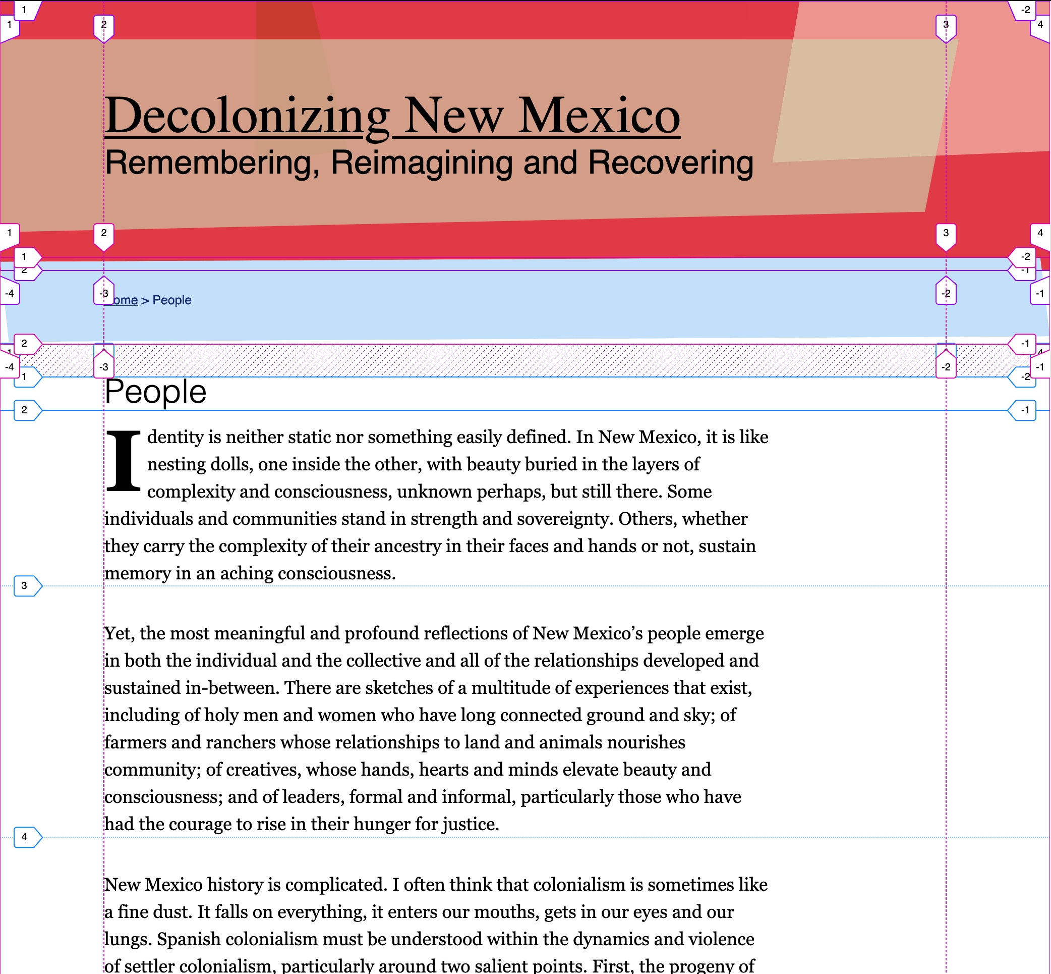
This project was fun due the fact that I was able to make liberal and effective use of CSS flexbox and grid. The main page layout is achieved with CSS Grid while the internal layouts are using flex. This made it much easier to get consistent vertical alignment and visual rhythm.
For this project, I decided on using Netlify for hosting and Deployment. Its a really small code base of entirely static files so Netlify worked out great. We don't deploy that often, and when we do its really just updating markdown files from managed over in our Forestry.io instance, which again, with a little extra work upfront getting these two services to work together was a snap. I'm looking forward to more of it in the future.
Creative Direction & Design Process

Development
Next Generation CSS
Hosting