Acqwash

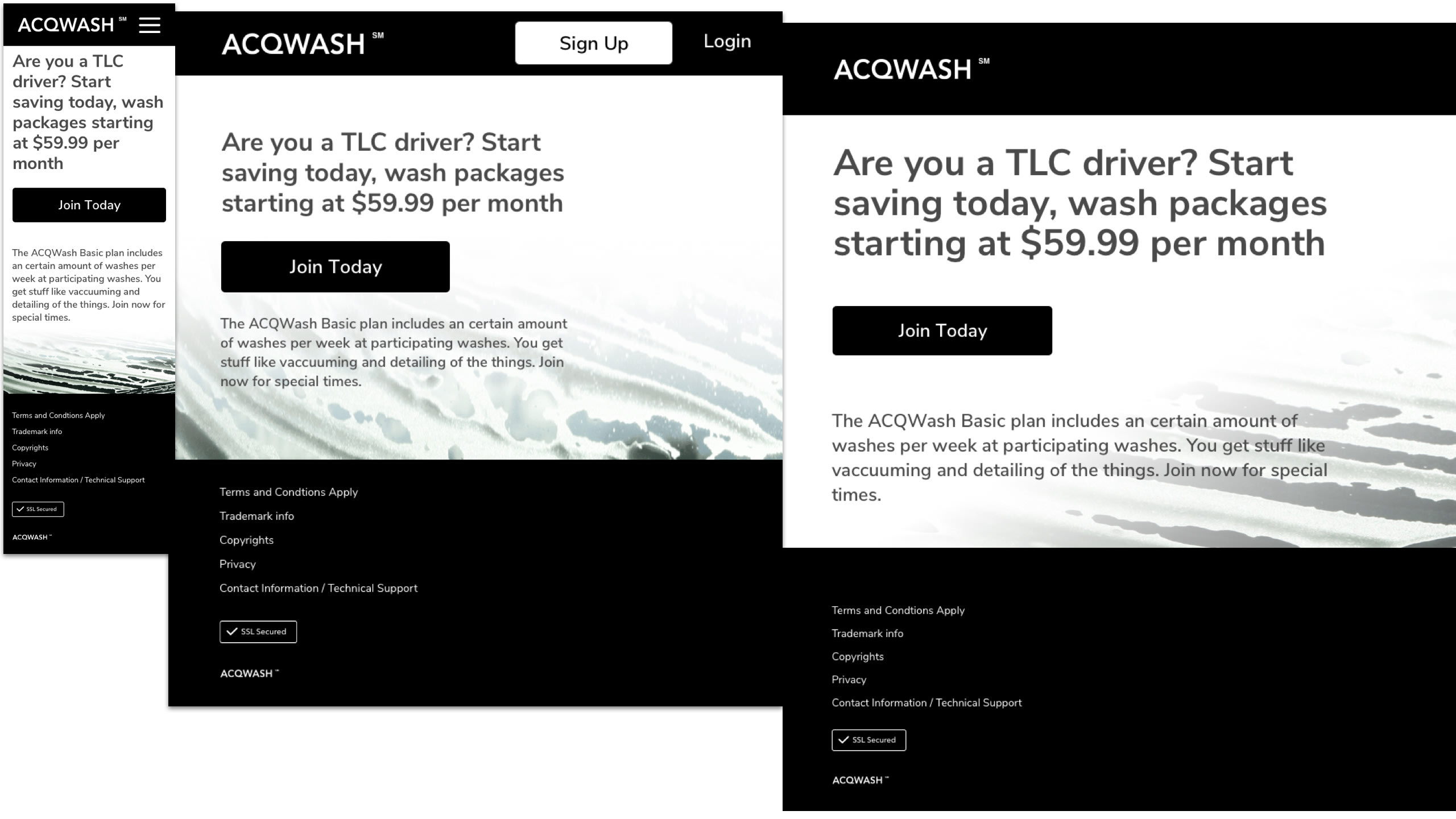
The Acqwash app concept is modeled on a subscription service as it applies car washes and essential maintenance services in the five boroughs of New York City. Targeting taxi drivers who regularly wash and clean their vehicles.

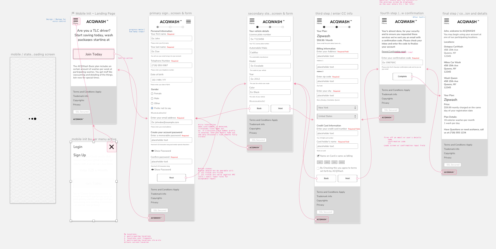
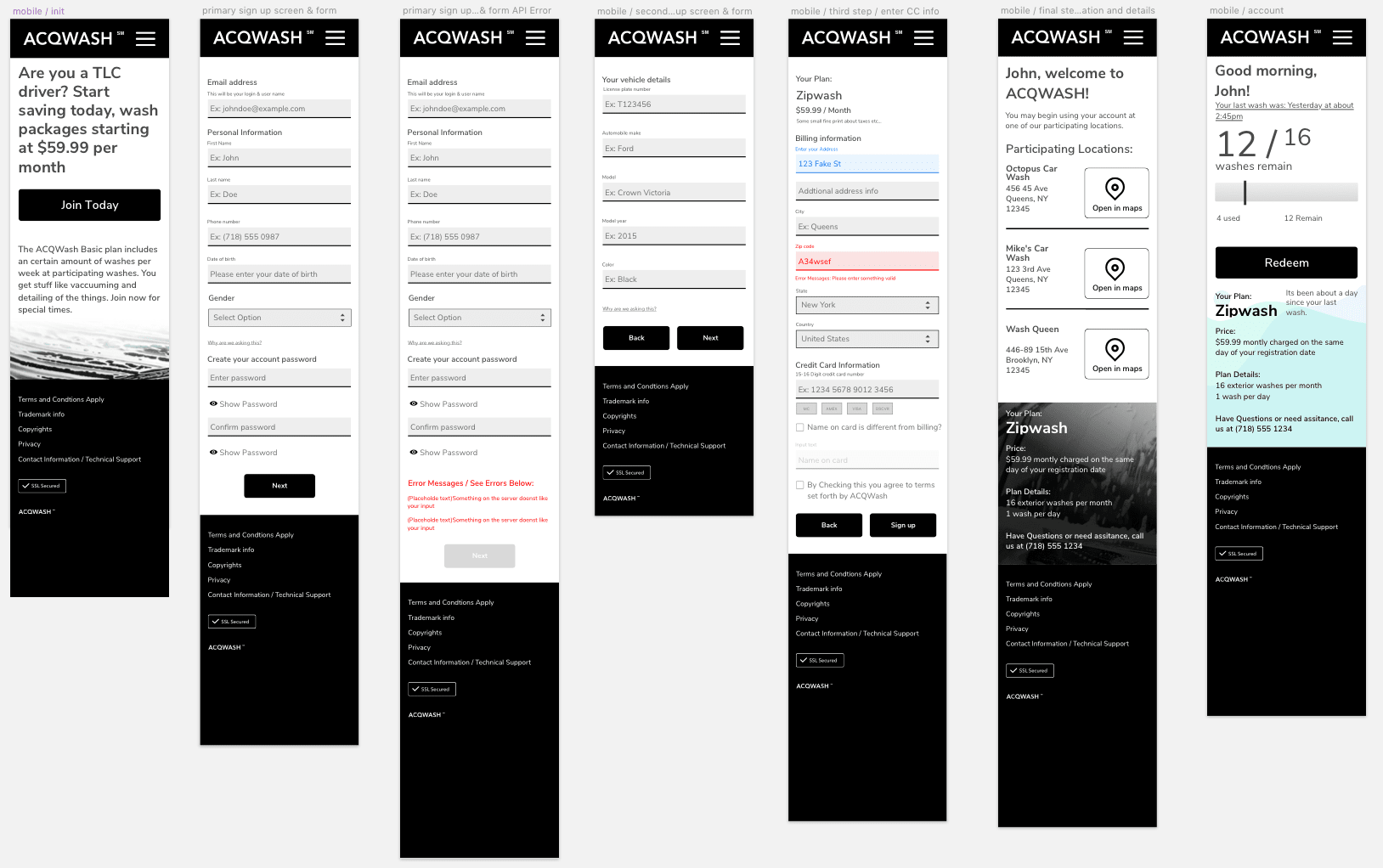
Our process was straight forward. We needed a dead simple and familiar onboarding workflow. We needed to ensure our users understood what we were asking of them concerning their personal information.


As the design brief was very open-ended, for V.0, the team decided to maintain a minimal aesthetic. For the logotype, we settled on the typeface Avenir. It is a favorite of mine because of its robust and reliable letter forms lending itself to readability.
For the app's body and label type, we went with Nunito Sans. It has a variety of weights available, giving us maximum flexibility where needed, and we could be confident in readability at any screen size.